What matters more in an image, content or style? We’re curious which of the two plays a more significant role in images. When does content matter, and when does style matter? Are the results consistent across different art styles?
🤔 Quantitative Analysis: Content 🤔
Based on the structure of convolutional neural networks which uses convolutional filters as edge detectors, we hypothesize that the amount of information in an image can be expressed as a function of the data present from the edges in an image. In our analysis, we worked with images by converting them into black and white format, and applying edge detection algorithms across different noise levels, and present the normalized amount of information in a picture.
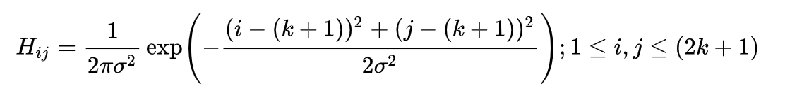
Canny Edge detector serves as a good baseline. Since all edge detection results are sensitive to noise, we first filter out thee noise to reduce false detection by applying colvolutions with a Gaussian filter, which smooths out the image to reduce the effects of obvious noise on the edge detector. The equation for a Gaussian filter kernel of size (2k+1)×(2k+1) is given by
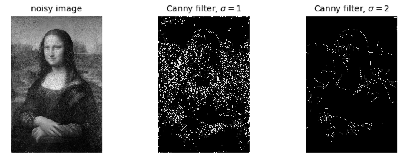
Given a picture, we first apply canny edge detection algorithm with two different smoothing values (sigmas = 0.5 and 2) across different art styles as we examine which art style conveys information through content rather than artistic styles. For instance, by applying the Canny Edge detection algorithm to the Mona Lisa, we have the following as the ‘content’ of the image.
To compare across different styles and sizes of images, we first convert an image to grayscale, apply canny filter to detect the edges, and sum up the non-zero elements and find the proportion of non-zero elements as compared to the size of the image array. This standardizes across different image sizes, with our results as shown below (using a sigma of 1 for all genres and images):
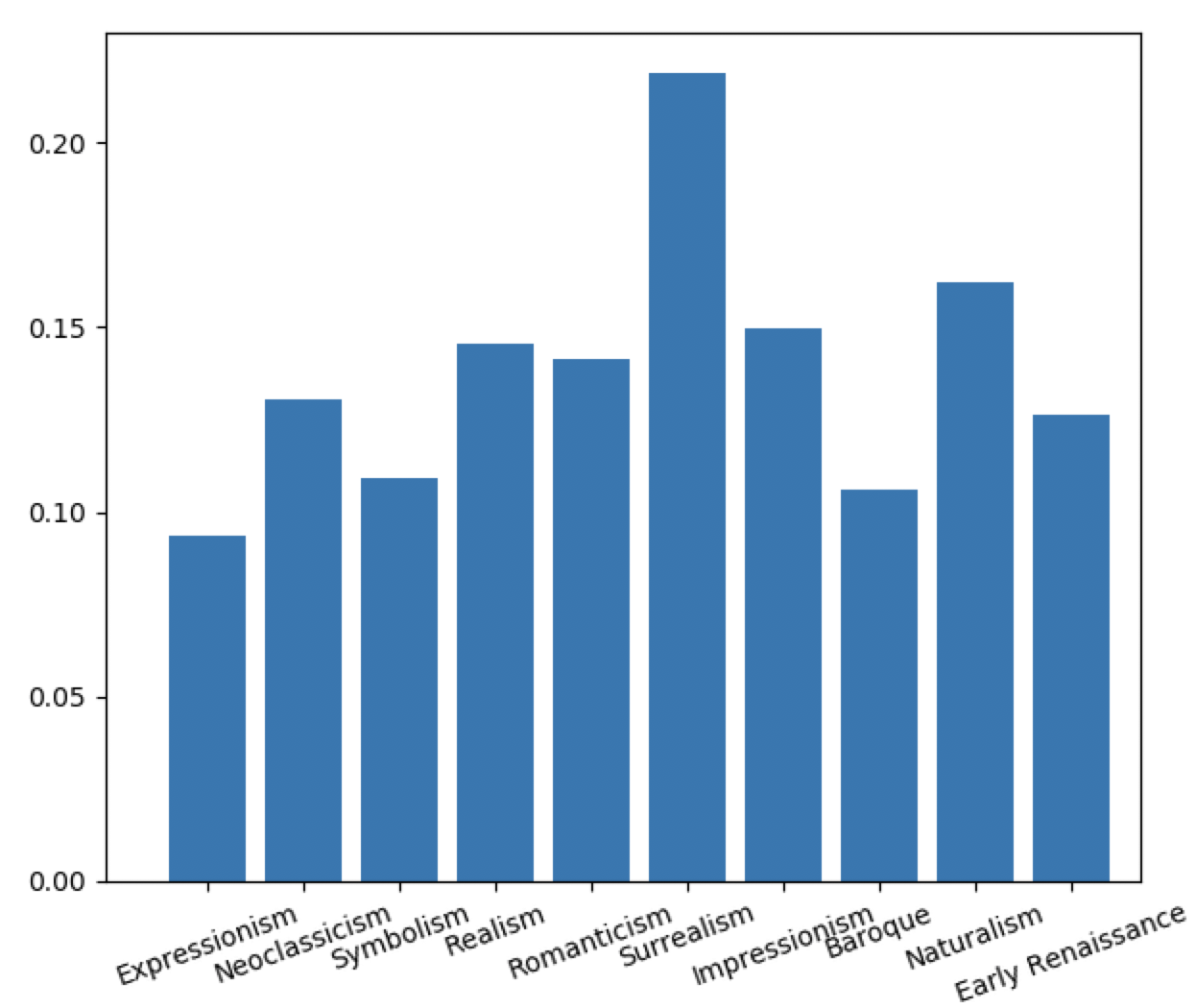
We see that using edge detection algorithms, surrealism is thought of having more edges (and thus being more ‘edgy’) as compared to other artistic styles such as baroque and expressionism. Romanticism, realism and impressionism have about the same content ratio.
🤔 Quantitative Analysis: Complexity 🤔
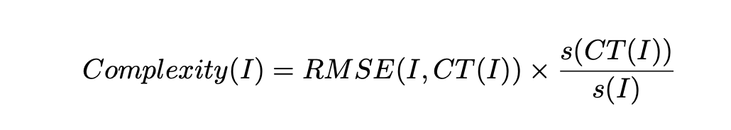
We also quantify an image through complexity, by how well we can compress it. Artwork across different genres shows different methods of information transfer and different levels of detail. One metric to analyze is if there is any variance of complexity across different genres. The idea of Kolmongorov complexity reflects the minimal amount of information needed to produce the object. This is a theoretical concept and cannot be feasibly calculated even if we are fixing the state space we are investigating, like images in our case. However, lossless compression-based complexity measures has been shown to provide a good approximation for the Kolmongorov complexity. The intuitive idea behind it is that images that are easier to compress typically take less information to express, which is defined as:
To test complexity across different genres, this image complexity metric was evaluated over all the images across the set and the respective means and standard deviations were observed.
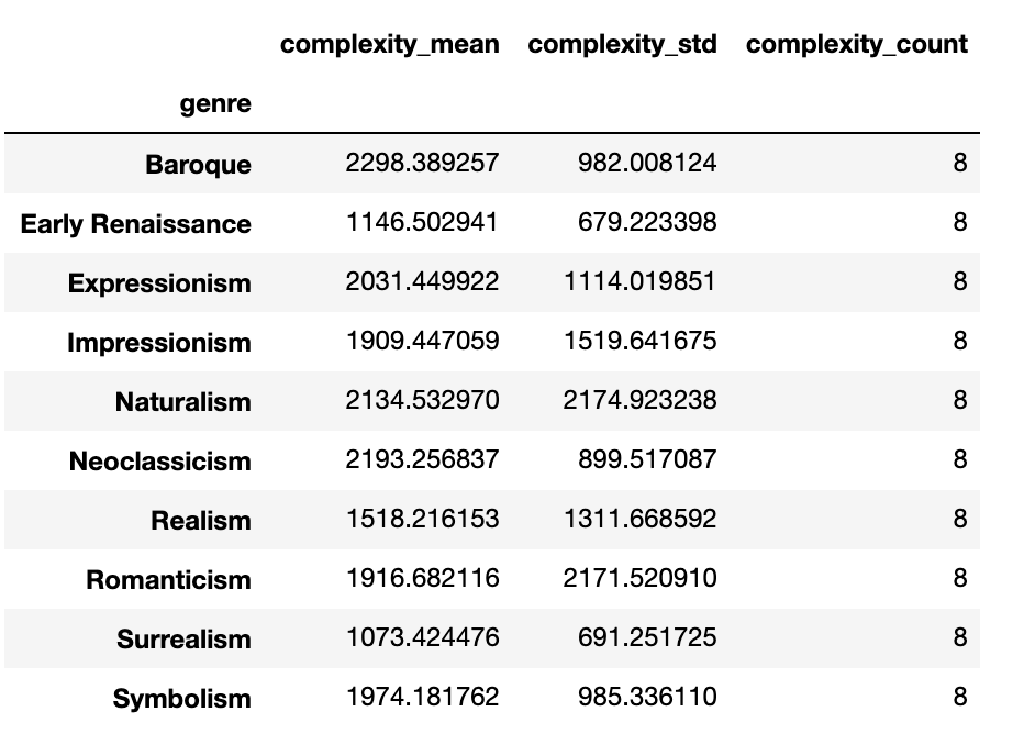
Analyzing the results, we note some interesting trends. Most of the genres complexities had means around 2000, as there probably was a base level of complexity associated with artwork that were in our dataset.
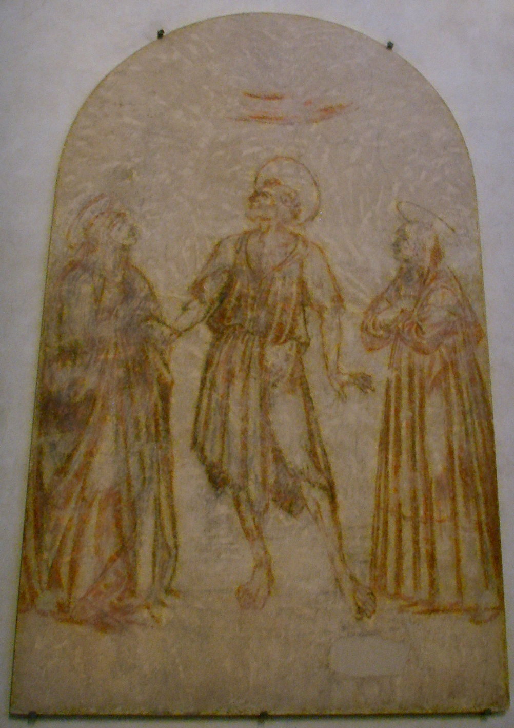
However, Early Renaissance, Surrealism, and Realism all had complexity means which differed from the rest. Analyzing our dataset, this was probably because of the lower level of complexity expressed in both very early (Early Renaissance of the 1300s) works because of the simplicity in artistic techniques developed at the time.
Analyzing our dataset, this was probably because of the lower level of complexity expressed in both very early (Early Renaissance of the 1300s) works because of the simplicity in artistic techniques developed at the time as shown below:
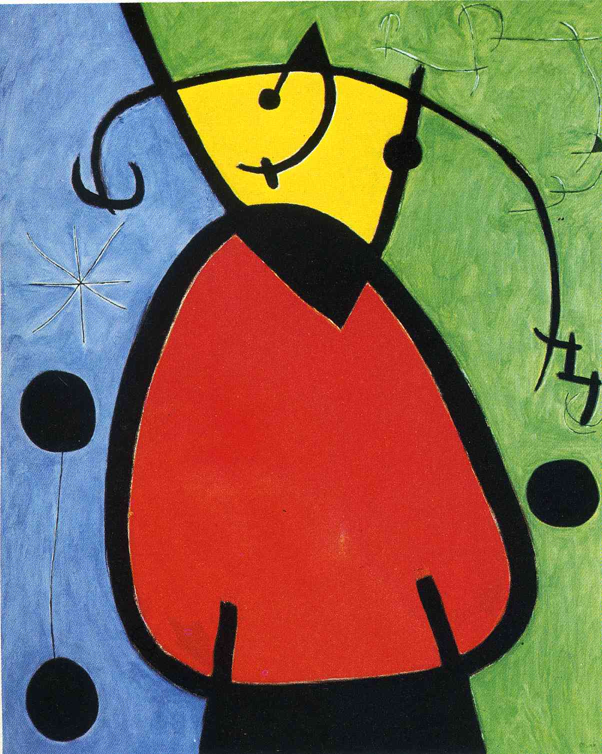
The lower complexity in Surrealism is also interesting. This also kind of made sense, as arts in Surrealism often exhibit weird artworks because of creativity pushing the definition of art, as images like (below) were included in our dataset. Although Surrealism existed in the 1900s, it was interesting that it had similar complexity measurements as Early Rennaisance, kind of like a cyclical process of art forms over the year.
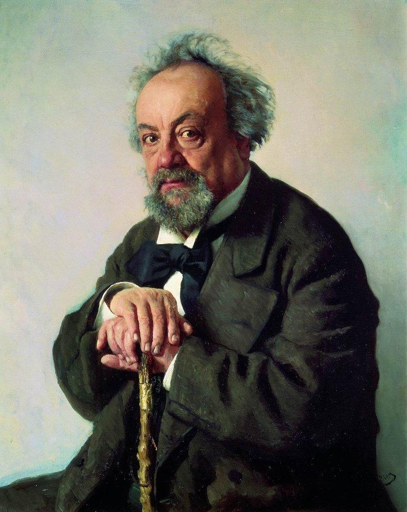
Realism, although basically the opposite of Surrealism in some regards, it still exhibited sub-regular complexity measurements, it also made sense in some regards. Realism was developed under the pretense of expressing images present in real life. As a result, there was probably a cap to the amount of information able to be introduced into an art form. Images like simple portraits (below) were in our dataset, which although detailed were quite plain compared to other more traditional types of art. It also made sense that this subnormal performance was not as extreme as that of surrealism and Early Renaissance.
🤔 Quantitative Analysis: Style Matrices 🤔
Having explored the content and complexity of painted works of art, can we quantify differences between art in different time periods and from different styles? To answer this question, we moved away from scalar metrics such as compression ratio, or content based on traditional computer vision filters, and instead opened up the field to learned feature representations.
In style transfer, there is the idea of style matrices that capture the low-level patterns and visual features of an image. This is constructed by taking the Gram matrix, a NxN matrix of pairwise correlations between the N activation channels of a pre-trained neural network at some decided intermediate layer. If this intermediate layer in discussion is “earlier” on in the forward pass of the network, the activations will likely be for a handful of low-level visual features, and therefore the Gram matrix will intuitively capture an image’s style through relative amounts of these various learned, simple features. On the other hand if this intermediate layer is “later” in the forward pass, it will have learned more complex, higher-level visual features, and the Gram matrix will capture content instead.
We chose to use VGG-16 as the pretrained convolutional NN whose activations we will analyze and construct style matrices for. We experimented with the activations from the convolutional segment of the architecture, at layers:
- 0: 1 learned convolution,
- 3: 2 learned convolutions (and appropriate BatchNorm and ReLU for every convolution),
- 6: maxpool after 2 learned convolutions,
- 13: maxpool after 4 learned convolutions.
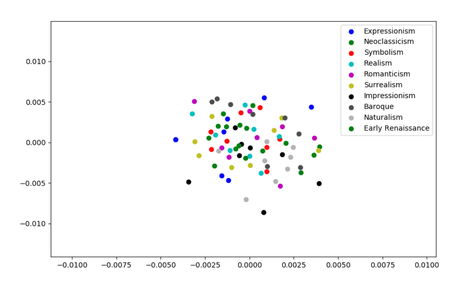
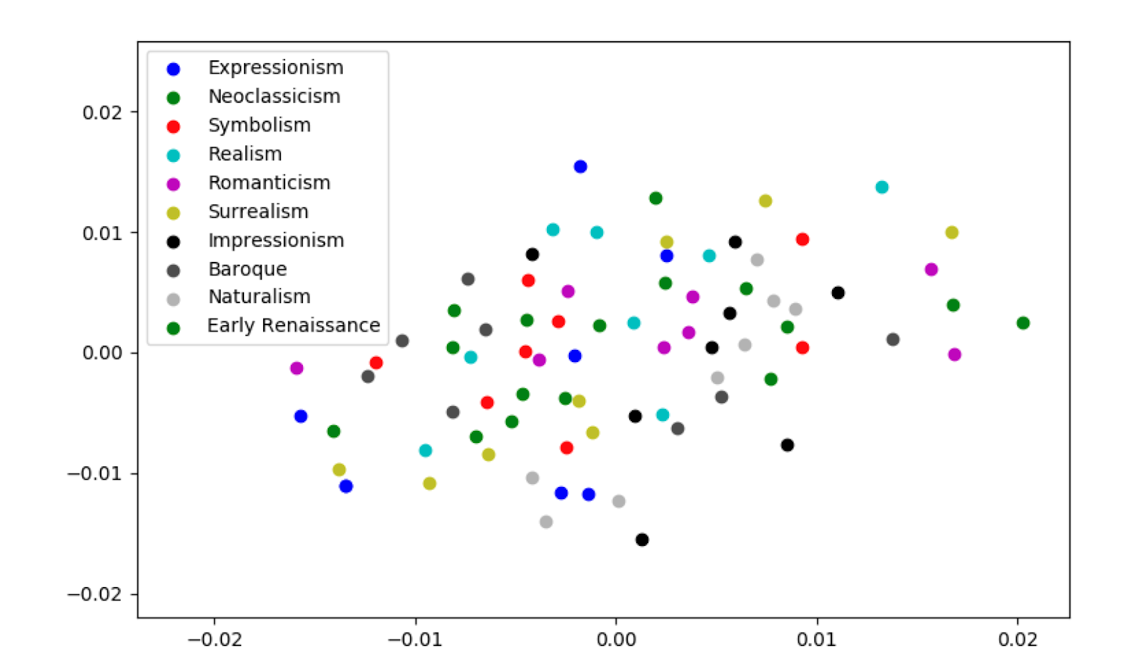
The Gram matrices for layer 13 is of shape (128,128) yielding a flattened 16384-dimensional style vector, whereas for layers 0, 3, 6 the Gram matrices are (64,64) yielding a flattened 4096-dimensional style vector. We try to plot these vectors to visualize if different genres’ styles cluster in different areas of the vector space.
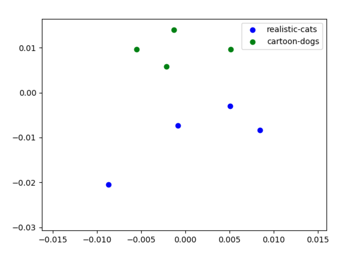
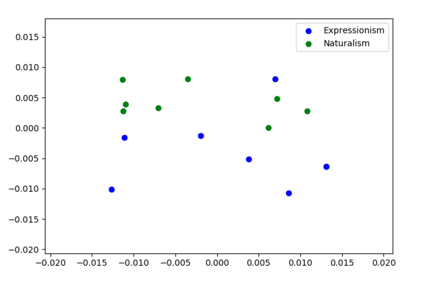
Some toy dataset results as a proof-of-concept between two genres:
- realistic pictures of cats, and
- animated/cartoon pictures of dogs.
For the actual artwork from 10 genres, a problematic issue appears immediately obvious: the style matrices are pretty high-dimensional (~4K-16K), which makes visualizations hard to construct accurately. We applied PCA to reduce the dimensionality in each case down to 50 components, and then created plots to respect the euclidean distances between style vector datapoints as much as possible with MDS (multidimensional scaling).
We plotted the results for layers 3, 6, and 13. The high dimensionality was still a problem, even with PCA applied, as the scatter plots do not show clear results. Some future improvements if we were to pursue this visualization:
- Try different distance metrics; since the flattened Gram matrix have non-negative entries, we can use cosine similarity (for example) instead of naive Euclidean distance.
- Try different hyperparameters for PCA, such as varying the number of components to reduce to.
- Acquire more than 8 datapoints per genre; this can give us more samples to approximate the genre clusters. With more data, we can plot batched averages of artwork samples (e.g. take the average style vector of every 100 artwork images to plot as 1 datapoint) instead of individual artworks to reduce variance.
🤔 Qualitative Analysis: Surveys and results 🤔
We’re curious whether our measures of our artistic measures quantified through metrics such as complexity, style matrices and edges would work well in real life by relating them to human evaluation. We conduct surveys on different art styles, starting by first giving an image, and asking which of the genres in text best categorizes the image. Here we present an example of a typical Pikachu meme:
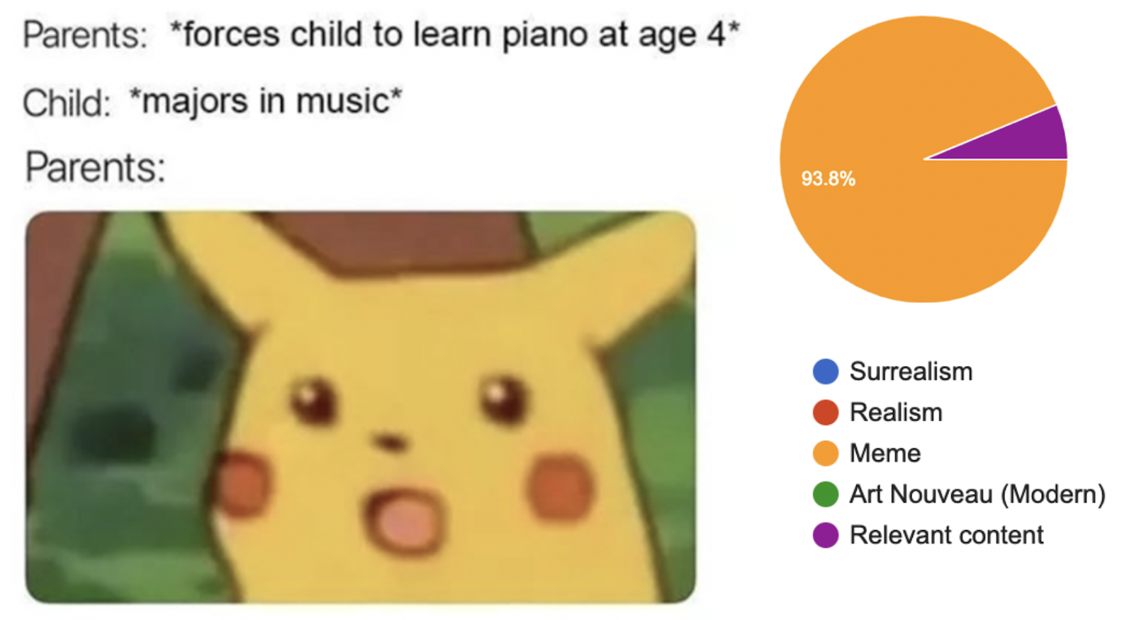
Here, 94% of responses label the above as ‘meme’ (with the remaining responses as ‘relevant content’. We’re further interested to see how different intersections of artistic styles and content interact, as shown by the hybrid ‘art’ below:

We then have a second stage where we provide an image, and ask which of the categories does the given image best fall under accompanying images. We were curious how the prior knowledge of text and image could influence our decisions and perception of image, with a very interesting example below:

Here, most responses classify the hybrid art to be closest to the real art, ‘The Scream’ (option 3) as compared to ‘memes’ (option 1 and 2). This presents several new insights: despite labelling the hybrid as a meme when given genres in the form of text, thee hybrid was labelled as ‘surrealism art’ when given images. We hypothesize that our prior knowledge on words and ideas/concepts influence our choice and how we perceive information, thus affecting information flow across domains (image-to-text); a more objective and reliable flow of information would involve transmission of information over the same domain (image-to-image).
The cross-domain transfer of information requires labels, concepts, and preconceived notions that condition us on how we perceive the information.
🤔🤔🤔 Outreach: Picture Guessing 🤔🤔🤔
For our outreach, we wanted to help the students play a game that carried the intuitive notions behind image compression, without the messy technicalities!
The game proceeds as follows:
- Two players A and B join the game: A is the describer, and B is the drawer.
- A is given an image (B cannot see it!), and writes 5 words/clues that will help B understand what’s in the picture. These words are given to B.
- B draws what they think the picture looks like based on these clues!
- After B is done, A reveals the picture and the two compare how well the drawing matches the picture.
- You can repeat this with different images and/or different amounts of words (10 words, 20 words) and see how well people do!
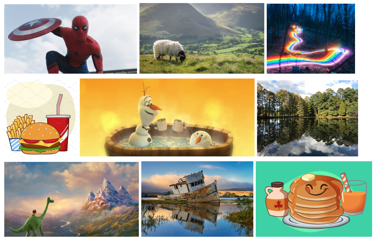
The middle schoolers really enjoyed the game, and although most played with their parents / another adult figure chaperoning them, a couple students played the game with each other. Some example images we had them guess are displayed. The drawings were even more interesting, but unfortunately we didn’t take any snapshots of their art! 🙁
This just made my day. I was cross searching my Pikachu scream picture on Google and found this! Never thought a meme of mine would end up in a scholarly study, but here we are. Just doing my part 🙂