Information Theory Through Puzzles

EE376A (Winter 2019)

Karan Singhal and Neel Yerneni

Most people are first introduced to the ideas of information theory through puzzles and games. We encountered 20 Questions and coin weighing well before entropy and joint source-channel encoding. Given the popularity of puzzles and games backed by information theoretic concepts, studying these puzzles can provide insight into how the general public views information theory and how information theoretic concepts can be communicated to a broader audience.

We discuss seven puzzles involving information theoretic concepts, four of which we created for the outreach event at Nixon Elementary School. We propose a simple taxonomy for these puzzles that reflects the fundamental concepts involved in each. While this taxonomy is not exhaustive, we hope it proves useful in demonstrating that these puzzles often have shared foundations in information theory.

Bits Encode Possibilities

As information theorists, we know that a small number of bits can be used to express one of exponentially many possibilities. This principle is used in games where one player is able to “read the mind” of another player, determining which of many possibilities the other player is thinking of despite receiving a seemingly paltry amount of information.

The 20Q handheld toy. Observe that answers to questions are one of four possibilities: yes, no, sometimes, and unknown.

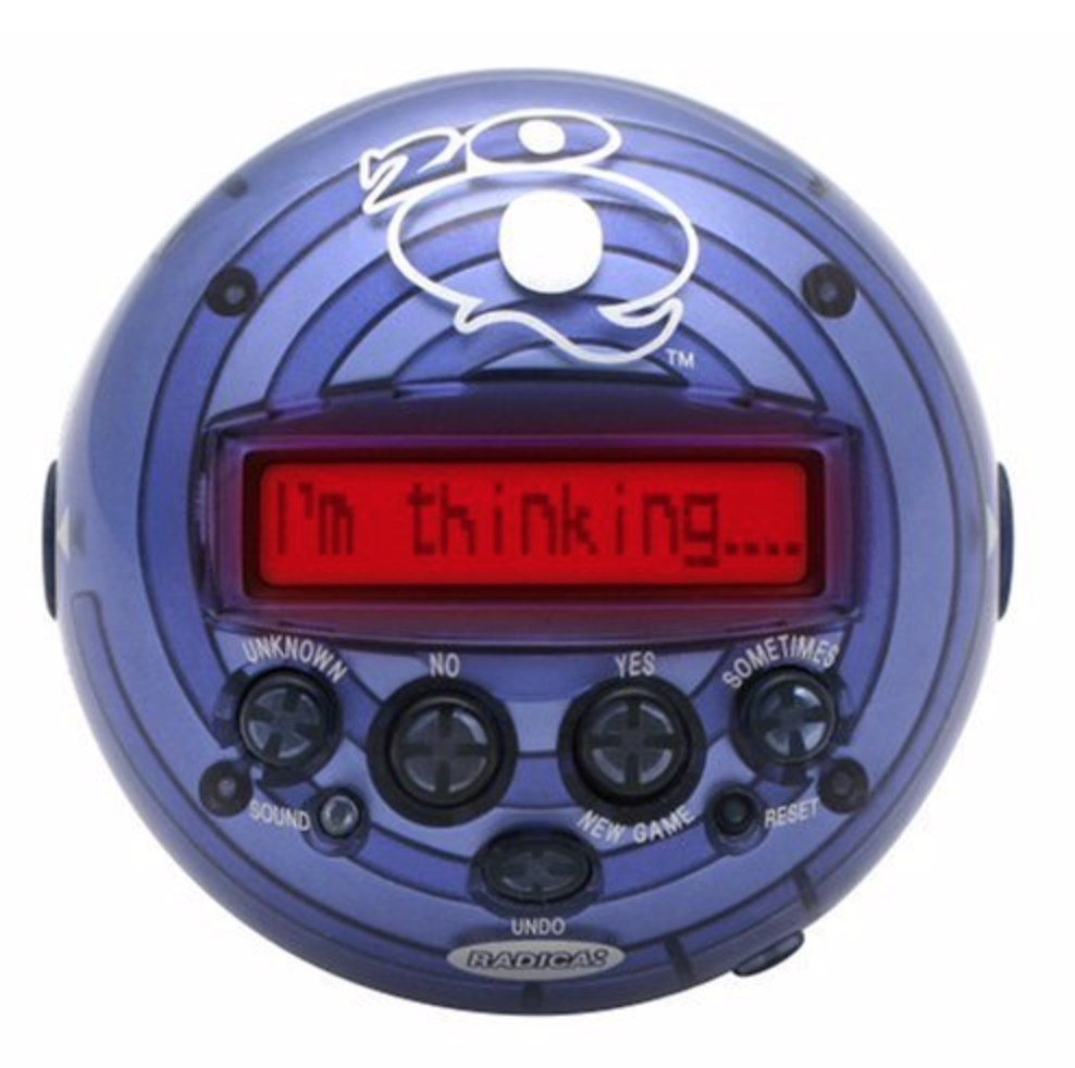
The most well-known of this category of games is 20 Questions, which was popularized by the 20Q handheld toy owned by many children during the 2000’s. In this game, the user is challenged to think of anything or anyone she wants–an actor, a board game, a fictional character, a national monument, etc. The toy asks a series of 20 yes/no/sometimes/unknown questions about the thing the user is thinking of (e.g., is the thing a person?). At some point when it becomes more confident, the toy begins guessing specific things that the user might be thinking of. If the toy cannot guess the thing after a number of guesses, the user wins. As owners of the original toy know, the toy was able to guess the thing that the user is thinking of–no matter what it was–almost every time. A modified adaptive version of the game, where questions can have more than four possible answers, can be found online.

Armed with the tools of information theory, we can begin to deconstruct the success of the toy. The toy must have a fixed list of possible things (roughly 2^20 = 1,000,000 things) that the user might think of (since it was not connected to the internet), and it must choose its questions so that the number of possibilities is split in roughly half each time to minimize the number of questions it asks. For example, if half the possibilities that the toy is still considering at some stage of the game are humans and the other half are not, the toy would do well to ask: Is it human? This says nothing about how to choose such a question efficiently, especially since people will provide unpredictable answers to ambiguous questions (e.g., is a fictional humanoid alien character a person or not?). Even in cases like this, the toy was expected to guess the thing correctly (and it usually did!). It turns out that the toy, whose algorithm was first developed in 1988 as a test of artificial intelligence, is actually powered by an artificial neural network that figures out which questions to ask and guesses to make. Though most probably did not realize it, for many children growing up in the 2000’s, this toy might have been their first exposure to ideas from both information theory and artificial intelligence! Unfortunately, the original toy was discontinued in 2011 due to licensing issues.

We were inspired by the success of this toy in presenting information theory concepts to the broadest possible audience, so we created our own simple game to evoke the same wonder in today’s elementary school students: 1000 Numbers. We asked students to think of a number from 1 to 1000 (inclusive) and told them we could guess it using ten guesses, as long as they told us whether our guess was correct, too high, or too low. If we could not get it within ten guesses, students won candy. We then performed binary search in real-time, guessing the number within ten guesses. It turns out that only ten guesses are needed, no matter which number a student chooses, even though 1000 < 2^10 = 1024. We show this in a simple Python simulation. This is because each guess actually provides more than a bit of information–we know whether our guess was too high or too low, but we also know whether it is correct or not, which is especially useful when the number of possibilities left to consider is low.

We found that 1000 Numbers was our most popular puzzle on the day of the outreach. Students of all ages were surprised and delighted to find that we could guess their number using few guesses (an average of eight guesses, according to our simulation). Even though we could always guess their number within ten guesses (unless we made an error during the mental math associated with binary search in real-time), we provided candy to all students who participated.

Decisions Create Information

Puzzles often ask people to make informative decisions. In an uncertain situation, making the right decision can reveal crucial information. This is best illustrated by example; consider the popular genre of puzzles involving weighing coins.

The canonical version of this puzzle is as follows. You have nine coins in front of you. All of them are identical except for one counterfeit coin, which is lighter than the other eight. If you have a balance that can compare the weights of any subset the coins with another subset, at most how many weighings would it take to figure out which of the coins is counterfeit?

Observe that each weighing can provide a variable amount of information, depending on the choice of coins to weigh. For example, if two random coins are weighed against each other for the first weighing, this does not seem very informative (in the worst case), since it is likely that we will be left with seven possible counterfeit coins after the weighing. Compare this to weighing two sets of three coins, which is part of the optimal solution and allows us to narrow the possible counterfeit coins to three in both the best and worst case. Thus, making the right decision can create important information.

In the canonical problem presented above, it turns out that just two weighings are needed. In the first weighing, some three coins are compared to some other three coins. Based on the result of this weighing, we can narrow down the possibilities to three. We then weigh any two of these. If one of these is lighter, then we have our desired counterfeit coin. If neither is lighted, then the third unweighed coin must be the counterfeit coin. This solution is illustrated below.

Just two weighings are needed to identify the counterfeit among nine coins. Observe that the problem reduces to determining the number of digits needed to represent nine possibilities in ternary.

Note that with each weighing we can reduce the number of possibilities by a factor of three using the optimal weighing, so the problem reduces to encoding nine possibilities in ternary, which can be done using two digits (corresponding to two weighings). Thus, if 27 coins were present instead, three weighings would be sufficient. Many other variations of this puzzle build off this information theoretic foundation.

Another example of a puzzle in which decisions create information is presented in Quanta’s puzzle column from July 2015. In this puzzle, you seem to be able to win a number-guessing game without any information.

The puzzle is presented as follows:

I write down two different numbers that are completely unknown to you, and hold one in my left hand and one in my right. You have absolutely no idea how I generated these two numbers. Which is larger? You can point to one of my hands, and I will show you the number in it. Then you can decide to either select the number you have seen or switch to the number you have not seen, held in the other hand, as your final choice. Is there a strategy that will give you a greater than 50 percent chance of choosing the larger number, no matter which two numbers I write down?

Pradeep Mutalik, Quanta Puzzle Columnist

When faced with this puzzle, most readers are likely to rely on concrete assumptions over the distribution from which numbers are drawn (e.g., people are likely to choose a number from 1 to 1000). It turns out this kind of assumption is not necessary.

The solution provided by the column is to pick a random number G before pointing to one of the hands. If the revealed number is larger than G, select the revealed number. If it is smaller, switch. The column provides a detailed discussion of this strategy and why it yields a greater than 50% chance of choosing the larger number (even if numbers are chosen over an infinite space), but the intuition is that in most cases, whether you stay or switch, your conditional probability of winning is still 50%. In one case, however, where one of the numbers is less than G and the other is greater, then you are guaranteed to win by playing your strategy. Then as long as you assume that there is a nonzero chance of your random number being in between the two numbers (a mild assumption), this strategy has a greater than 50% chance of choosing the larger number.

In this puzzle, as before, being strategic about how to act in a constrained environment introduces information.

Channels Are Noisy

Channels transmitting information are not always able to transmit exactly what was originally intended–there is often noise. Languages evolved as people needed to be able to communicate given the chance that there might be noise in transmission. The redundancy of modern language has rendered many problems related to noisy channels obsolete in practical situations. This allows people to infer correct meaning even with noise in the transmission.

To conceptualize this as an activity, we wanted to explore scenarios within the English language where original words in a cohesive text could be inferred despite the redaction of certain letters. In the outreach activity, we introduced two games that built on this. The first was Reconstructing Text. We randomly replaced certain letters in a piece of text and had the student reconstruct the text to the best of their ability. With this game, we noticed that students had little trouble reconstructing the text correctly as they were able to infer what the missing words were. We noticed that most of the words that students got incorrect were ones where most of the consonants were replaced by noise rather than the vowels. This made sense as consonants often carry more information than vowels in English words, which we hoped to convey to the students.

The second game we made was the Text Message Game. For this game, students worked in pairs. One student was responsible for masking the letters and the other was to guess the letters that were blacked out. Though this game was less popular due to its complexity, we thought it gave students an even stronger glimpse into the limits and nuances of the redundancies of language as they were encouraged to black out as many letters as they could but so long as their partner could perfectly reconstruct it. This activity provided a much more hands-on exploration as students also had to directly consider the implications behind the transmission of their information.

Coding

The encoding of information is another critical concept in the field of information theory and tends to be more complex. In constructing an activity surrounding this concept, we wanted to obviate some of the more involved notions and convey more abstract, generalized concepts in the encoding of information. Specifically, we wanted to explore the idea that smaller symbols could be combined in different ways to communicate more complex concepts.

In our activity at the outreach event, we had students pair up where one student was blindfolded and the other student needed to give the first instructions to complete a maze. However, to do so, the instructing student could only use three pre-outlined words (we used soy, sugar, and glue in our activity), even though there were four possible directions for movement in the maze. It was then up to the students to come up with a plan for how they wanted to convey the proper instructions via these three words beforehand.

We were surprised by the diversity in methods taken by students to use these three words to instruct their partner. While some students worked in the dimension of the words themselves (i.e., using permutations of the words to convey more complex instructions), others made use of other dimensions of variation. One example was a group of students who decided to alter their pitch in saying the word as a mechanism for signaling the direction of movement. We did not expect this solution!

Conclusion

We have proposed a simple taxonomy for seven puzzles involving information theoretic concepts, some of our own creation. Besides furthering our understanding of how these puzzles relate, our analysis may also prove useful in producing curriculum introducing students to information theory. The outreach event is highly relevant: in our station, we presented four puzzles (1000 Numbers, Reconstructing Text, Text Message Game, and Soy-Sugar-Glue) using worksheets that students could take home with them, along with copious prizes (candy) for students who were able to complete the puzzles. We found that students were generally quite excited to complete the puzzles both individually and in pairs, indicating that these and other puzzles could serve as excellent teaching tools for the popularization of information theory.

Our full worksheets that we created for the outreach event: 1000 Numbers, Reconstructing Text, Text Message Game, and Soy-Sugar-Glue.

The Mystery Channel

EE376A (Winter 2019)

Imagine you are given a communication channel C, which takes in a messages x = x_1, \ldots, x_n of length n, with each x_i taking values in an alphabet of size k. C is noiseless, except that it has a malfunction, which is that it is deleting a set of indices D \subset \{1, \ldots, n\} of size d, so the output is C(x) = (x_{I_1}, \ldots, x_{i_{n-d}}), where I = \{1, \ldots, n\}\setminus D are the indices which are not deleted by C. If you can just figure out what the set D is, then you can again use C as a noiseless channel by sending the actual message only in the indices I and putting arbitrary symbols in D. The situation is diagrammed below in Figure 1 with n = 8, k = 2, and D = \{4, 7\}.

Figure 1: An example of two messages sent through the same channel. The message length is n = 8, and the alphabet size is 2. The deletion indices are D = \{4, 7\}. Note that the channel is deleting the same indices on both inputs.

This is essentially the question which we posed to Nixon Elementary School students on Information Theory Night. The implementation had a few kid-friendly changes. First, the messages, instead of symbols, were sequences of colored cards, which the kids got to choose from. The channel itself was a cardboard box with holes on both sides for the messages to go through. To increase the mysteriousness, we draped a big black blanket over the apparatus, so that the whole thing had the appearance of a Houdini-esque magic trick.

A picture of us with the setup, complete with candy and an eye-catching poster.

To send messages, children would insert their flashcards one by one into the box, and one of us would sit behind it and choose which cards would get through to the other side. Another one of us would then lay out the cards that did get through cleanly on the other side, so that the kids could compare it to what they put in.

A glimpse behind the scenes.

Our project had a few key strengths. The first was that it was interactive. We wanted the kids to really get a sense for the problem by playing with it with their bare hands (literally). Instead of lecturing them, we tried to give them a chance to learn what worked and what didn’t through trial and error. This not only kept them engaged, but also gave them a rare opportunity to engage with a problem that was completely new, and which they didn’t know had a ‘right’ or ‘wrong’ answer. Instead of being told what to do, they got to experiment, which is always the first step when approaching any problem.

The next strength was that we could scale the difficult of the problem, either by making them use fewer colors (a smaller alphabet), or by increasing the number of deletions. After solving the one deletion case, many of them found that two deletions was quite a bit more difficult. This introduced them to the idea of generalizability, and showed how a problem which is trivial in one parameter regime could be much more nuanced in another.

Overall, the outreach project was a great experience. It was exciting to see children interact with a problem we had been working on. I also feel that the challenge of communicating the problem to them also gave us a better understanding of what the important aspect of the problem really were.

Moving on from the outreach project, we will now formalize the problem at hand. We will mainly focusing on the binary alphabet case, k=2. Our first observation is that that given a set of codewords to send through the channel, we can model the problem of identifying the deletion indices as solving linear system.

Let x_1, \ldots, x_m \in \mathbb{F}_2^n be the m codewords we will send through the channel. We then let X be the the matrix whose columns are these codewords, that is,

We then formulate the “deletion matrix” P, which, when multiplied by a codeword x\in\mathbb{F}_2^n, yields the result of passing x through the channel, y\in\mathbb{F}_2^{n-d}. We do this by letting $P$ be a submatrix of the n\times n identity matrix. In particular, if D is the set of indices being deleted and we let e_i be the one-hot vector in the i-th coordinate, let P be the matrix of columns \{e_i\}_{i\not\in D} in ascending order. For example, if n=4 and D=\{3\}, then

Note that knowing P tells us exactly which indices are being deleted.

We now observe now that if we write PX=Y, with our newly defined matrices P and X, then Y is the matrix whose columns are the results of passing the columns of X, x_1, \ldots, x_m \in \mathbb{F}_2^n, through the channel. Thus, we now see that given a set of codewords, i.e. given X, identifying the deletion indices is equivalent to solving the linear system PX=Y for P.

The question is then of designing the matrix X such that PX=Y is solvable for any P, while minimizing the number m of columns of X. In particular, we are interested in the minimal m, and the corresponding X.

We now note an easy upper bound on the minimal such m, \log_2(n). In particular, we let X be the n\times \log_2(n) matrix whose rows are all the binary of length \log_2(n). Upon observing the matrix Y, it suffices to check which of the length \log_2(n) binary strings are missing from the rows of Y.

Again, this is easiest to understand by way of example. Suppose we have a channel that deletes the indices D=\{2, 4, 5\} from binary strings of length eight. Then, the matrix P is given by

We then let X be the matrix

We then have that Y=PX is

We can see that Y is missing the rows (0~0~1),(0~1~1),(1~0~0), which tells us precisely that D=\{2, 4, 5\}

Though this scheme works well when thinking of d growing as a fraction of n, it is overkill when d is a constant. For those who wish to think about this problem further, it might be interesting to think about this parameter regime, and also think about how the algorithm can better take advantage of the fact that you can observe the output from the previous messages before choosing the next one to put through. Our solution right now ignores this fact, choosing all the messages at once, beforehand (the distinction is referred to as “adaptive” vs. “non-adaptive” algorithms).

The are interesting generalizations of deletion identification, to which this particular problem could be reduced, such as recovering arbitrary projection matrices (over finite fields). We are interested in an closed form for how many columns are needed. By reduction arguments, the case of deletions may give interesting bounds on the above generalizations.

Finally, we would like to thank Prof. Weissman and the teaching staff of EE376A for their advice on this project as well as their hard work in organizing the outreach event.

Comparing information content of language representations under compression

EE376A (Winter 2019)
Cindy Wang and Stephanie Chen

If you’re sitting in a cafe and feel a little hungry, you might say to the waiter, “I would like a croissant, please.” However, if you’re in Paris, you might say, “Je voudrais un croissant, s’il vous plaît.” On a surface level, these sentences are saying the same thing — they are direct translations of each other, after all. Both sentences communicate the first-person subject (I), a verb expressing want or desire (would like), the object (a croissant), and a function word to express politeness (please). Upon closer inspection, you might notice that the French sentence has extra information: the conjugation of the verb voudrais reinforces the first-person subject, the article un denotes that croissant is a masculine noun, and the formal pronoun in s’il vous plaît offers context — the speaker is saying please to someone they do not know.

In a way, language is an encoding for semantic information. We can think of the rules of various languages (e.g. English or French) as different encoding schemes, and the various representations of each language (like writing systems, transcription systems, etc.) as further encodings. Under this paradigm, we might wonder whether the encoding mechanisms of different languages vary in their quality and information capacity, and whether different language representations vary in how they preserve the information transmitted by the language. In this project, we compare how several writing and transcription systems in three different languages perform under the same compression scheme, in order to explore how compressible information varies across languages and how information preservation varies across language representations.


Experiments

Dataset

For our project, we used the German-English and Spanish-English parallel corpora from the Europarl dataset, which is a collection of transcriptions, in a variety of languages, of European Parliament proceedings from 1996 to 2011. Because these corpora are parallel translations of proceedings by professional human translators, each set contains approximately the same amount of basic semantic information expressed fluently in each language.

DEFLATE Compression

For compression, we chose the DEFLATE algorithm as it is widely used, fast for experimentation, and lossless. DEFLATE uses a two-stage approach (both of which we discussed in EE376A!):

  1. Matching and replacing duplicate strings with pointers (the LZ77 algorithm)
  2. Replacing symbols based on frequency of use (Huffman coding)

A DEFLATE data stream consists of a series of blocks. Block size is arbitrary, and blocks can be encoded in one of three ways:

  1. As raw literals between 0 and 65,535 bytes in length. This option is used for data that is incompressible.
  2. As a compressed block, using a static Huffman encoding. This is generally used for short messages, when the compression gains achieved do not warrant the cost of generating and storing a Huffman tree.
  3. As a compressed block, using a dynamic Huffman encoding. Most blocks are stored in this way. 

Stage 1: LZ77

The deduplication stage proceeds as the LZ77 algorithm described in class. Duplicate strings in a block are found and replaced with a length (8 bits) and distance from the beginning of the duplicate (15 bits). A minimum match length of 3 and sliding window size of 32KB are used.

Stage 2: Huffman coding

The second stage involves generating (if this is a dynamic Huffman block) and encoding via Huffman trees. This achieves bit reduction by replacing commonly used symbols with shorter representations. (See Huffman coding class notes for more details.)

Each symbol in the output of stage 1 may be a literal, a match length, or a match distance. Stage 2 replaces each of these with a literal/length code and optionally a distance code. Two trees are thus created:

  • Literal/length code (288 symbols)
    • 0-255: The literal bytes/symbols 0–255.
    • 256: End of block.
    • 257-285: Match length range, with extra bits* to encode the actual length.
  • Distance code (32 symbols)
    • Distance range, with extra bits to encode* the actual length.

* For example, symbols 4-5 encode distances 5-8. One extra bit is needed (in addition in the bit already communicated via whether the symbol is 4 or 5) to encode the index of the actual distance within the range 5-8.

DEFLATE thus uses a scheme that places literals, lengths, and an end-of-block symbol together into a single alphabet. Distances are encoded in a separate alphabet, and this can be safely done since a distance can only occur after a length.

The two above codes are themselves encoded compactly as canonical Huffman codes, with run-length encoding for the bit length of the code for each symbol. It is easy for the compressor to choose whether the static or dynamic compressed size is smaller, as the static compressed size can be computed using the same statistics (the number of times each symbol appears) as are used to generate the dynamic trees.

A optimizes implementation of DEFLATE is available via gzip, which we use here and is included in most *nix distributions. (Fun fact: in addition to gzip, DEFLATE is used in PNG image files and the ZIP file format.) The compressed sizes below refer to the size of the GZ file produced by running gzip.

As a baseline, we compress the raw parallel corpora using DEFLATE. The compression rates of the three languages are similar, with German and English both at just under 68% and Spanish slightly better at 69%. Notably, the German and Spanish uncompressed file sizes are both about 14% larger than the English file.

screen-shot-2019-03-19-at-11.07.10-pm

IPA Transcription

Using eSpeak, a text-to-speech synthesizer, we then convert all three corpora to transcriptions in the International Phonetic Alphabet (IPA), the standard phonetic alphabet used in linguistics. The IPA contains 107 letters and 52 diacritical markers, which together capture the wide variety of vowel and consonant sounds, tones, stresses, and other phonetic features present in human languages. IPA transcription provides a standardized way to represent the way in which a language actually sounds, bypassing the idiosyncrasies of writing systems. For example, the English sentence

There has therefore been enough time for the Commission to prepare its programme and for us to become familiar with it and explain it to our citizens.

is transcribed in IPA (using Received Pronunciation, a.k.a. standard British English) as

ðeə hɐz ðˈeəfɔː bˌiːn ɪnˈʌf tˈaɪm fəðə kəmˈɪʃən tə pɹɪpˈeəɹ ɪts pɹˈəʊɡɹam and fɔːɹ ˌʌs tə bɪkˌʌm fəmˈɪliə wɪð ɪt and ɛksplˈeɪn ɪt tʊ aʊə sˈɪtɪzənz

Note how certain sounds in English that require long (and often unintuitive) character combinations to write become collapsed and standardized in IPA. For example, the sound indicated by ugh in enough, which can also be spelled as f, ff, or ph in English, becomes /f/ in /ɪnˈʌf/. Likewise, the sh sound indicated by ssi in Commission (also spelled in a variety of ways) becomes /ʃ/ in /kəmˈɪʃən/. 

Since this transcription format coalesces different spellings of identical sounds, we predicted that the compression rate would be higher for IPA transcriptions than for plaintext (Table 1). As expected, the compression rates were higher across the board. Surprisingly, however, the compression rates of the IPA transcriptions for each of the three languages were identical.

Screen Shot 2019-03-19 at 11.07.16 PM.png

Though IPA is the most recognized standard in phonetic transcription, its heavy use of characters outside the standard Latin alphabet makes it difficult to compare file sizes with our plaintext, since written German, English, and Spanish all mostly use standard Latin characters that can be encoded in 1 byte. For example, our files are UTF-8 encoded, which means that the 1-byte o in Commission is replaced by a 2-byte /ə/ once transcribed into IPA. This artificial augmentation is partially addressed by the increased compression rate of IPA transcriptions, but both the raw and compressed IPA files are much larger than their plaintext versions.

X-SAMPA Transcription

To address this mismatch, we then considered phonetic transcription into X-SAMPA, an alternative transcription scheme that covers the full IPA using only ASCII characters. Though the IPA already makes use of all 26 lowercase Latin letters, X-SAMPA leverages uppercase letters, numbers, and special ASCII symbols like @, so that nearly all (with one or two exceptions) IPA characters used in German, English, and Spanish can be represented with a single byte of ASCII. The example sentence above, in X-SAMPA, becomes

De@ h6z D”e@fO: b%i:n In”Vf t”aIm f@D@ k@m”IS@n t@ pr\Ip”e@r\ It-s pr\”@Ugr\am and fO:r\ %Vs t@ bIk%Vm f@m”Ili@ wID It and Ekspl”eIn It tU aU@ s”ItIz@nz

We can see in Table 3 below that as expected, X-SAMPA transcription results in much smaller raw file sizes than IPA transcription.

Screen Shot 2019-03-23 at 7.50.42 PM

We note that neither of the transcriptions yield smaller compressed sizes than plaintext, even though X-SAMPA uses the ASCII symbol alphabet. The transcription process inherently encodes additional information — specifically, the precise pronunciation, including stress and vowel length, of words, which is often not obvious from their spellings. Therefore, the raw and compressed sizes here are not directly comparable with those from Table 1.

Insights

We observe that in every transcription scheme, from plaintext to IPA to X-SAMPA, the compression rates of each of our three languages were within 2% of each other. This suggests that the symbol distributions in German, English, and Spanish are approximately the same. In particular, the compression rates were closest for the IPA transcriptions, in which the mapping from symbol to phonetic sound is closest to one-to-one. This results in an interesting linguistic insight, which is that the nth most common sound in German is about as common as the nth most common sounds in English and Spanish. Examining the raw IPA symbol counts (as a percentage of total text), we see that this holds true, but though the distribution is similar, the actual sounds that are most common in each language are quite different. Note that we include IPA symbols for whitespace (_), stress (‘), and vowel length (ː), as they are relevant characters to the compression algorithm, but they do not represent specific sounds.

Screen Shot 2019-03-24 at 11.31.14 PM

Potential future explorations might include an encoding process that first maps IPA symbols to an 8-bit character value (there are only 163 total IPA symbols), then performs optimal plaintext compression. This could yield smaller raw sizes for IPA transcriptions, but as the symbol distribution would still be the same, this would probably not improve compression rate. Another interesting direction is lossy compression. Since written plaintext is not always recoverable from phonetic transcription, we might want to evaluate the information gain and loss of a transcription + compression pipeline.


Outreach: How much does your sentence say?

Four kids standing in front of a poster board. The poster board has blocks with word segments on them.

For the outreach event, we wanted to communicate a simplified subset of the ideas from our project. Specifically, we wanted to show, through an interactive activity, how information content varies across languages. The goal of our activity was to address two main points:

  1. Different languages take different amounts of space to express the same amount of meaning (e.g. Chinese words are usually 1-2 characters in length, while English words average around 6 letters).
  2. Some languages require speakers to express certain kinds of information that other languages don’t (e.g. the gender of croissant in French).

We came up with a few dozen morphemes in English, Chinese, and French and wrote them on rearrangeable blocks (cardstock with Velcro). We chose the morphemes to allow for different subject pronouns, verb tenses and conjugations, objects, adjective agreement, and even conversion of adjectives into adverbs. We selected English, Chinese, and French as our display languages due to the apparent variation in the written text, as well as grammatical and morphosemantic variation. Students were invited to create sentences in a language of their choice (usually English), and we helped them create parallel sentences in the other two languages.

 
outreach-fig

The same sentence in English, Chinese, and French. Morphemes with the same meaning are connected with an arrow, e.g. {play, 玩, jou-} are approximately equivalent. We can see that even though this is the same sentence, its length varies across languages. For example, French uses many more characters than Chinese. Moreover, some languages express meaning that others omit. Observe the morphemes connected by the dotted line: Chinese has no morphemes to represent that 游戏 (game) is plural, but English and French use -s and -x respectively.

Just by counting the number of blocks in each sentence, the students could observe how languages differ in the number and type of morphemes, or “units of meaning.” The activity was a fun introduction to the intersection of information theory and linguistics. Students and parents alike were also excited to learn how to say the same sentence in two new languages!

img_3538

An example sentence created by Tsachy!


We hope you found this post interesting and informative! Please direct any questions to Cindy Wang (ciwang at stanford dot edu) and Stephanie Chen (stephchen at stanford dot edu).

Information Theory and the Immune System

EE376A (Winter 2019)

About Me

I am a PhD candidate in the Cancer Biology program at Stanford. I’m fascinated by how the immune system works, and my primary motivation for my thesis work is to better understand its intricacies in order to improve patient care. You’ll see that my outreach activity and final project are both linked to these interests. If you have similar interests, or if anything I’ve shared below sparks your own interest, please feel free to reach out! You can reach me at matallah@stanford.edu.

Outreach Activity

How do we measure information?

Information is a decrease in uncertainty. For my outreach activity I wanted to convey this concept to students, and help them understand how to qualitatively estimate how much information is given in a each of a set of ‘clues’ based on how close each clue gets them to an answer. At each step I asked them how many possible answers there were, and how close they felt they were to getting the right answer (this was indicated by sliding a marker along an answer bar.

Concept Introduction

We began with a simple example: suppose they asked me what my favorite color was.

Now I give them the first clue: it’s not black.


And the second clue: it’s the color of the sky.


When I asked them which clue got them closer to the answer, and then which one had more information, all of the students correctly identified the second clue. The younger students often said that they had the final answer after the second clue, although one particularly precise student observed that the sky could be almost any color depending on the weather, atmospheric contents, and time of day!

Concept Application

With the concept of information content thus understood, we moved on to the main activity. I had four stuffed monkeys on my table who didn’t feel well – each student was invited to choose a monkey, and they would try to figure out what was wrong with it. They were then given a clipboard with the monkey’s “medical record”, containing a table listing the four possible things that could be making the monkey feel ill. Each of the four illnesses had three characteristics: how a patient with that illness would feel, what the symptoms were, and which immune cells would be active (I briefly explained that immune cells are cells in your body that help fight disease).

I then gave them the clues one by one, and they were instructed to circle the clue each time they saw it on the clipboard. Some clues applied to most of the diseases, therefore not reducing uncertainty and providing little information, whereas some were specific to a single disease. By the end of the activity, they will have circled things in each column, but one column had many more circles than the others. Linking this back to information theory, each clue thus allowed them to narrow down the possible diagnoses, until the uncertainty has been reduced enough to allow them to diagnose the patient. We then reviewed the relationship between information and a decrease in uncertainty (or, getting closer to an answer), and I asked them which clues provided the most information, and which diagnoses they would give their chosen monkey. With the exception of the very youngest students, they were most often able to correctly identify the diagnosis as well as the clues that gave the most information.

Examples of activity sheets completed by students during the outreach event

Summary of Outreach

I really enjoyed the outreach event, and was impressed by how quickly the students were able to grasp and apply the concept of qualitative measurement of information. They were excited and engaged, and I myself enjoyed seeing all the different activities and displays other students in the class had to offer. It was also fun to think about all the concepts we learned in class through the lens of choosing one to present to kids in an interesting way.

Project

Title: Analysis of the Immune Communications Network

Authors: Michelle Atallah

Introduction

The immune system is a complex and dynamic network of immune cells and components that are responsible for defending us from pathogenic threats and returning us to health after illness and infection. Too much immune activity can be harmful, as occurs in autoimmune diseases, while too little can leave one with an inability to fight of infections, resulting in death. The ability to precisely modulate immune activity is therefore of high interest in both research and clinical medicine.

An effective immune response is the result of highly coordinated activity across the many components of the immune system (Altan-Bonnet 2019). Although recent technological advances have enabled us to collect information about immune responses in great detail, there currently exists no method that allows us to integrate these measurements into a comprehensive, systems-level analysis of the immune response (Kidd 2014). As a result these studies are largely descriptive and provide very few mechanistic insights.

The fields of genetics and proteomics have long benefited from network analysis tools that interpret experimental data in the context of existing knowledge of genetic and proteomic biological networks (Huang 2009), recognizing that no component in these systems exists or functions in isolation. Despite equal recognition that the immune system also functions as an integrated system, no such tool exists for immunology. The goal of this project is to take a first step towards developing such a tool.

Preliminary Data

For the first part of my PhD I set out to build a network map of the immune system to serve as a knowledgebase upon which immune network analysis methods could be built. To this end I have recently built and characterized a manually-curated map of the immune interactome by manually extracting immune interactions described in Janeway’s Immunobiology 9th edition (Murphy 2017), a canonical immunology textbook (Figure 1a). In this network entities that interact with the immune system or participate in an immune response are represented as nodes. Edges describe the interactions between the nodes, with information recorded for each edge including the type of interaction, receptors or other molecules involved, and immune processes in which the edge participates. By thus structuring the information presented in the textbook we have created what is, to the best of our knowledge, the first system-wide graphical representation of the human immune interaction network (Figure 1b).

Figure 1a: Example of sentence extraction. The sentence and the network diagram both contain the same amount of information, but the way it’s presented in the network diagram makes it much easier to understand the relationship between the nodes/components.
Figure 1b: Network diagram of the immune system/graph of the immune network

This graph essentially represents the immune communications network, and makes it easier to examine how information is transmitted across the different components of the immune system. This is a large network, with 253 nodes and 1112 edges. With a low density of 0.02 and a short average path length of 3.25, the immune network is a sparse but very efficiently connected network. This makes sense: the low density reflects the specialization of immune components while the short path length is appropriate given the need for effective communication (in the event of pathogenic invasion, a rapid immune response is of the essence in containing and eliminating an infection).

Goals

Immune responses take place wherever there is a pathogen or infection, often in the tissues. However, it is difficult to collect samples of tissues from humans – oftentimes blood is the only sample available. The first goal for this project was therefore to establish whether levels of circulating immune cells in the blood accurately reflect active immune mechanisms in humans. To this end I found a dataset of longitudinal immune measurements taken from peripheral blood of patients who had received either a flu vaccine, pneumonia vaccine, or an inert saline injection. I examined these data for time-lagged correlations between levels of circulating immune cells, and asked whether they reflect known immune mechanisms (Goal 1) and whether I could map these correlations back onto my immune interaction network to reconstruct the path through the network that the immune system took to produce the current active immune response (Goal 2).

Datasets

The data used for this project were generated as part of an IRB-approved study (Obermoser 2013) and are publicly available on ImmuneSpace (immuespace.org; Brusic 2014) under acquisition number SDY180.

This dataset consists of 47 patients randomized into three cohorts, each of which received one of the one of the following vaccines: influenza (Fluzone), pneumonia (Pneumomax23), or a saline injection (control). Blood was collected from each patient at 9 timepoints ranging from before vaccination until 28 days post-vaccination, and assays were done to examine levels of circulating cytokines as well as populations of circulating immune cells.

Methods

The data described above were downloaded as CSV files and analyzed in R. The data were filtered to select only timepoints that were regularly spaced (-7, 0, 7, 14, 21, and 28 days post-vaccination) in order to enable normalized cross-correlation analysis. Cross correlation was calculated for each immune cell pair, and the highest correlation for each pair (along with its lag) was extracted. Patients were grouped according to treatment cohorts, and correlations were compared across the cohorts.

Results

Because I am interested in identifying how information is transmitted across the immune network and by which cells it is transmitted, I focused on strong correlations (correlation scores > 0.05) with a lag > 0. There were 1639 immune cell pairs that fit this criteria among flu patients, 942 pairs in pneumonia patients, and 809 pairs in patients who had received an inert saline injection. This is higher than expected, as these patients’ immune systems were not deliberately stimulated, and therefore theoretically shouldn’t have initiated any immune response. However, it is difficult to control for environmental exposure in human subjects, and it’s possible that these patients’ immune systems were responding to something other than the experimental intervention.

Many of the correlation results were as expected. For example, CD3+ cells (all T cells) correlated nearly perfectly with CD4+ cells (a subset of CD3+ T cells) with a lag of 0.
In addition, Plasmablasts (activated but not yet terminally differentiated B cells) correlated quite well (correlation score of 0.798) with Plasma cells (terminally differentiated effector B cells) with a time lag of 1. Given the frequency of sampling once a week, this correlates with the known timeline of B cell differentiation, which is estimated at 7-10 days (Murphy 2017).
These sense checks recapitulated known dynamics of immune responses, providing a level of confidence that further analyses could be believable.

Enriched cell types across patient cohorts
After finding these strong correlations for each patient group, I began by asking whether the cell types involved in these significant correlations differed across the groups. I found that they did, and that the cell types involved were more similar between the flu and pneumonia vaccine cohorts than between either vaccine cohort and the saline control group (Figure 2).
The saline cohort had higher representations of many types of activated helper T cells. The only exception was T follicular helper cells, which are a cell type that aid in the activation and proliferation of B cells to initiate an antibody response. It therefore makes sense that these were the only T helper cell population enriched in both vaccine cohorts, as both vaccines elicit antibody responses. Likewise, the saline group showed far lower levels of antibody-secreting plasma cells.


Figure 2: Counts for each cell type are plotted and colored according to cohort. A blue line connects the flu and pneumonia data points to make it easier to visualize where the saline points differ most.

Comparison of the influenza and pneumonia vaccines
I began comparing the treatment groups by looking for directional interactions (composed of a pair of immune cells with correlation above 0.5 and time lag of > 0) that were common between patients who had received the flu vaccine and the pneumonia vaccine. There were only 27 such interactions, of which the majority (n = 17) involved regulatory T cells and Plasma cells (antibody-producing B cells). Regulatory T cells are responsible for limiting immune reactions to prevent excessive damage to the host, and both vaccines are known to produce protective antibodies (made by Plasma cells). It is therefore expected that this part of the immune mechanism is shared between the two patient cohorts.

Pathway tracing and validation of multi-step pathways
Because each timepoint in my dataset is 7 days apart, correlations in which the lag is >1 or <-1 suggest that there is an additional effector cell or immune component facilitating the interaction. I randomly selected several of these multi-step interactions and attempted to identify these middle effector components using my directional immune communications graph. An effector was identified in every instance. In some cases, only a single mediator was found on the path between the two nodes (Figure 3a), in other cases, a few possibilities existed (Figure 3b). Given the highly interconnected nature of the immune network, the number of possibilities expanded quite a bit with each additional lag step. Figure 3c illustrates the possible mechanisms behind the identified correlation of CD4+ T cells with neutrophils with a lag of 2 timepoints.

Figure 3: An illustration of

Conclusions

This project confirmed that levels of circulating immune cells do appear to reflect active immune mechanisms in humans, which means that peripheral blood samples can reliably be used to assess immune system activity. Though I was able to identify time-lagged correlations between immune components, the high level of connectivity between components in the immune network made it difficult to map these correlations onto the network in a way that would output a suggested path that resulted in the current immune response.

Future Directions

I believe that the field of immunology will benefit greatly from increased application of quantitative techniques to biological problems. Many concepts from information theory are especially relevant, as our understanding of immune responses is essentially an understanding of how information is shared across the immune network. Two particularly promising directions that I would like to pursue in the future are below:

Calculate directed mutual information to measure the strength of edges in the network: Though we have a relatively solid understanding of the relationships between immune components, it is not yet known what the relative strengths of each are. For example, it is now well established that in cancer patients, immune cells are often activated against tumor antigens, but unable to perform their functions because the tumor suppresses the immune system (Allegrezza 2016). There are thus multiple activating mechanisms as well as multiple suppressive mechanisms at play, but how a cell integrates these conflicting signals and decides what to do is not known. Mutual information might be an approach that can help us discover out how cells weigh and integrate these signals.

Quantify the information in each immune signal. Because the immune system needs to be able to do its job even in the midst of significant interference, there’s a significant amount of redundancy in the immune communication network. Continuing the example of suppression of the immune system by cancer, there exist many immune “checkpoints”, which are receptors on the surface of immune cells that tumors use to suppress immune function (Topalian 2015). While some have had significant success in the clinic, others chosen based on knowledge of their near-identical functions have been completely ineffective in patients (Lowe 2018). If we could quantify the amount of information in each of these many seemingly similar signals, we could potentially use it to select the mechanism that is most likely to result in clinical benefit if targeted therapeutically.

The principles of information theory apply to so many different fields, and I look forward to continuing to apply the concepts I’ve learned in this class to my research going forward.

References

Allegrezza MJ, Conejo-Garcia JR. Targeted Therapy and Immunosuppression in the Tumor Microenvironment. Trends Cancer. 2017 Jan;3(1):19-27. doi: 10.1016/j.trecan.2016.11.009. Epub 2016 Dec 23. Review. PubMed PMID: 28718424.

Altan-Bonnet G, Mukherjee R. Cytokine-mediated communication: a quantitative appraisal of immune complexity. Nat Rev Immunol. 2019 Feb 15. doi: 10.1038/s41577-019-0131-x. [Epub ahead of print] Review. PubMed PMID: 30770905.

Brusic V, Gottardo R, Kleinstein SH, Davis MM; HIPC steering committee. Computational resources for high-dimensional immune analysis from the Human Immunology Project Consortium. Nat Biotechnol. 2014 Feb;32(2):146-8. doi: 10.1038/nbt.2777. Epub 2014 Jan 19. PubMed PMID: 24441472; PubMed Central PMCID: PMC4294529.

Huang, D.W., Sherman, B.T., and Lempicki, R.A. (2009). Bioinformatics enrichment tools: paths toward the comprehensive functional analysis of large gene lists. Nucleic Acids Res. 37, 1–13.

Kidd BA, Peters LA, Schadt EE, Dudley JT. Unifying immunology with informatics and multiscale biology. Nat Immunol. 2014 Feb;15(2):118-27. doi: 10.1038/ni.2787. Review. Erratum in: Nat Immunol. 2014 Sep;15(9):894. PubMed PMID: 24448569; PubMed Central PMCID: PMC4345400.

Lowe, D. IDO appears to have wiped out. Science Translational Medicine, 2018. http://blogs.sciencemag.org/pipeline/archives/2018/05/01/ido-appears-to-have-wiped-out

Murphy, K., and Weaver, C. (2017). Janeway’s Immunobiology (United States: Garland Science/Taylor & Francis Group).

Obermoser G, Presnell S, Domico K, Xu H, Wang Y, Anguiano E, Thompson-Snipes L, Ranganathan R, Zeitner B, Bjork A, Anderson D, Speake C, Ruchaud E, Skinner J, Alsina L, Sharma M, Dutartre H, Cepika A, Israelsson E, Nguyen P, Nguyen QA, Harrod AC, Zurawski SM, Pascual V, Ueno H, Nepom GT, Quinn C, Blankenship D, Palucka K, Banchereau J, Chaussabel D. Systems scale interactive exploration reveals quantitative and qualitative differences in response to influenza and pneumococcal vaccines. Immunity. 2013 Apr 18;38(4):831-44. doi: 10.1016/j.immuni.2012.12.008. PubMed PMID: 23601689; PubMed Central PMCID: PMC3681204.

Topalian SL, Drake CG, Pardoll DM. Immune checkpoint blockade: a common denominator approach to cancer therapy. Cancer Cell. 2015 Apr 13;27(4):450-61. doi: 10.1016/j.ccell.2015.03.001. Epub 2015 Apr 6. Review. PubMed PMID: 25858804; PubMed Central PMCID: PMC4400238.